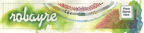
2.26 banner color adjust, originally uploaded by robayre.
I’ve just finished this banner for my blog. What do you think? Is it horrible? Honest, but constructive criticism please. Do the colors turn you off? Is it too busy? Unbalanced? Whatever, I’d love to hear.
I’m thinking about changing it up quarterly, so it wouldn’t be permanent. But I don’t want to turn away viewers because my banner turns their stomach, lol.
You know what is funny is that whenever I do these kind of things, especially anything with watercolors, I feel that I end up loving the part that goes outside the borders the most. The part that should be cut away or covered up is the part that I just become enamored with. So in the above, there is a pencil border which is supposed to be the edge, but I couldn’t yet bear to crop out all those lovely edges.
Today I found a little inspiration via Craft Magazine’s blog for these paper mache beads.
I think they are so beautiful, but better yet, with this technique you could make so many different things.
It got me thinking about how my internet buddy Natasha makes beautiful paper beads.
It also reminded me of this book that I saw for sale at Dick Blick, but put back on the shelf because I didn’t “REALLY need it” and have been regretting it ever since.
I actually picked it up for a friend, thinking the book would be cool for them, but that paper jewelry wasn’t for me. I thought it has to be very temporary and fragile and a bit “crafty” for me. But looking through the book I was amazed at how much could be done. Paper jewelry can indeed be taken beyond ‘construction paper elementary school craft’ to Functional Art!
Thanks everyone for commenting on the previous posts, I feel loved :)
I commented on you Flickr how much I liked your new banner. Then i see that you were going to crop everything on the “outside.” DON’T! I think it looks so much better with the bleed – much more “you.” If you can, just resize it to include these “edges.”
ps: I “hate” it when “people” use quotations “indescriminately”… yet I “guess” I do it too. ARG!
“That’s okay”
LOL
Thanks Erin, your a chum, my chronie, and “great all around friend”
My eyes get all excited at the sight of that luscious green, so I say, “Aye” (in a completely appropriate use of quotations, although Erin would not stop cringing at an e-mail from me).
Best quote rant ever: John Cusack in Say Anything. “Why are you talking like that girl Sheila? [air quotes]”. (The “Sheila” is a coinkydink – and yes I also abuse parentheticals). I love me some punctuation.
I’m not really a quotation mark nazi, I guess I just feel guilty when I overuse them – or when my aunt overuses them – or when I see them in the newspaper… ok, I guess I am. But I don’t want to be. Acknowledging I have a problem is the first step, right? BTW: spell check is asking that I capitalize the word “nazi” (quotes used correctly to identify word), but I refuse because it would give that group a sense of respect that I refuse to give it. *hot button*
That’s interesting. I wasn’t going to leave a comment but the name and mail fields were already filled in so how could I not. What’s up with that? I’ve always had to enter them myself before.
I like the new banner. The colors are nice.
I agree there is nothing proper about nazi therefore no capitalization needed.
I am also an abuser of the dot-dot-dot ala…
I love it. Open-ended/trailing thoughts are the best kind.
I just wrote on your flickr how I love the watercolor green, and the graph paper… and then clicked over here to see how it looked on your blog proper. And I think it really works!
And I love this discussion of punctuation… I tend to abuse the dot-dot-dot a lot… ;)