
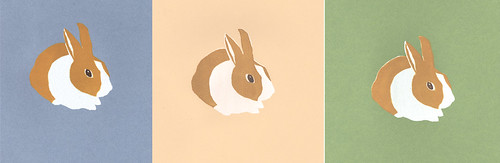
This weekend I started on a silk screen to finish a postcard. While I was working, I figured I might as well do some prints on other papers as well. You can see them above on the blue, cream and green papers. It was originally going to be a 4 color print but I decided against doing another (shading to show more detail and depth) because the piece that I did this for didn’t really need it. My original intentions were for the inks to be very translucent and I used a bit of transparent base but when I printed, the white almost disappeared on the postcard. Also, because of all the mixing, mixing, mixing and the transparent nature of the inks, the prints I did on solid paper were extremely bubbly. Instead of being a solid color there is all this undesirable texture.
Well it was fun and it got me to break out my screens and inks. Maybe I’ll do some more silk screening.
I love that! It’s a perfect print for Easter. :)